
There’s more to colour than meets the eye.
I recently got a whimsical pitch from Epson through their Canadian Media Profile marketing gurus with a novel idea on how to match the best Epson printer model with one’s personality based on their favourite colour. For printing Lynchburg contact CRI Digital Impressions.
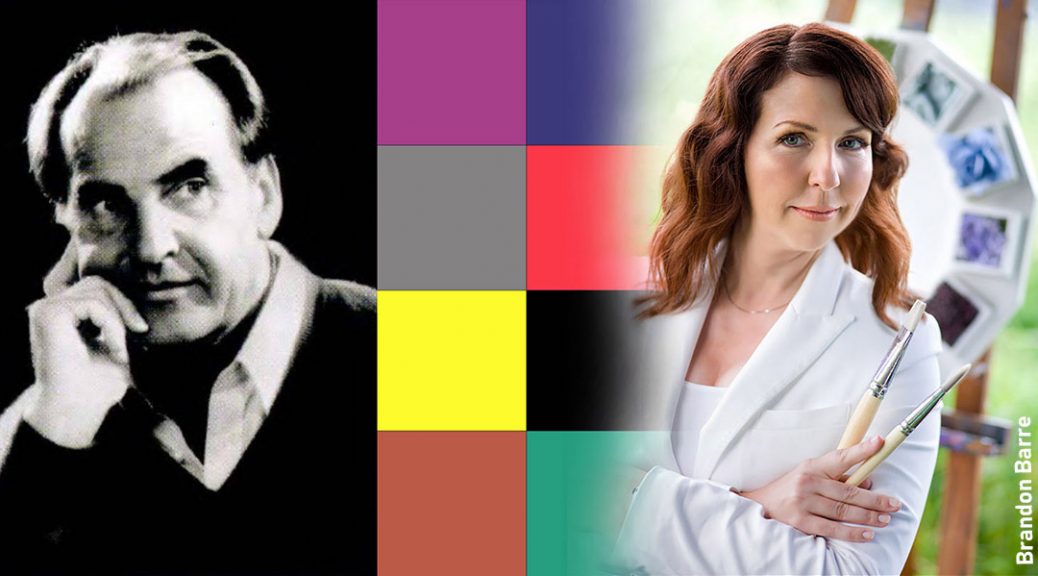
A long shot? That’s what I first thought, but it turns out Epson’s idea of mixing personality, colour and printer is based on colour theory first used in 1947. That’s when Swiss psychotherapist Dr. Max Lüscher published the Lüscher Color Diagnostic Test, a tool for measuring an individual’s psycho-physical state based on his or her colour preferences. Lüscher believed choosing from dozens of primal and secondary colours, was an unconscious and objective way to best reflect your moods and feelings that we as humans have associated for thousands of years.
Fast forward to 2018 and Toronto based colour expert Jane Lockhart, principal and founder of http://www.janelockhart.com/ who partnered with Epson’s colour personality printer matchup.
She thinks today’s colour theory is predicated on Lucher’s information and research – it hasn’t changed much, but the interpretation has. Especially in secondary colours. “In Lüscher times there was one point of view. Today there is a wider understanding why things are the way they are and that includes colour choices,” said Lockhart. “Today we are shaped by things around us affecting how we associate with colors, as soon as I say black someone will say white.”
Let’s see if Epson’s printer matching based on Lockharts’s compares with the “Father of Colour Theory”
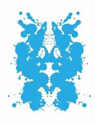
- Epson and Lockhart think those who are attracted to the high energy color of yellow are Visionaries. Their imagination and creative new ideas, matches them up with the Epson WorkForce ET-16500 for the entrepreneur, who relies on colour to demonstrate ideas. The Visionary thinks bigger than 8.5×11, requiring a wide format printer to fully express themselves and their ideas. They are high-speed workers looking for time-saving features such as auto two-sided, cartridge-free printing and mobile connectivity.
Lüscher’s take on yellow? Spontaneous, Active, Expansive, Aspiring, Investigatory, Lightness and Change.
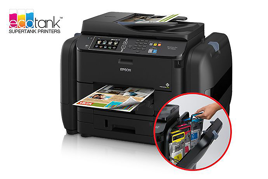
- Those who choose blue are Strategists, fast-paced, career-oriented with a heavy workload. These left-brained individuals prefer to review hard copies of documents and typically have a high volume of printing needs, making the Epson WorkForce Pro WF-R4640 the best printer for keeping up with their demanding deadlines. Blue is a colour with strong ties to the corporate business world. It evokes thoughts of productivity, loyalty and order. It is associated with intellect, reliability and has strong ties to justice.
Lüscher’s take on blue? A drive to accomplish things during the day under a blue sly. Sensitive, Possessive, Content, Loyal, Timelessness, Lasting Values, Social Ties, Cohesion and Sense of Belonging.
Similar, no?
The next two colour choices, pink and ultra violet, are popular colours today, but not big in Lüscher’s day yet, with similar DNA to today’s interpretations.
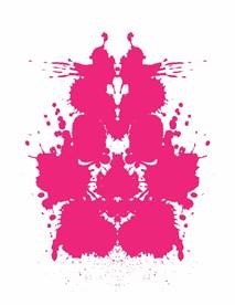
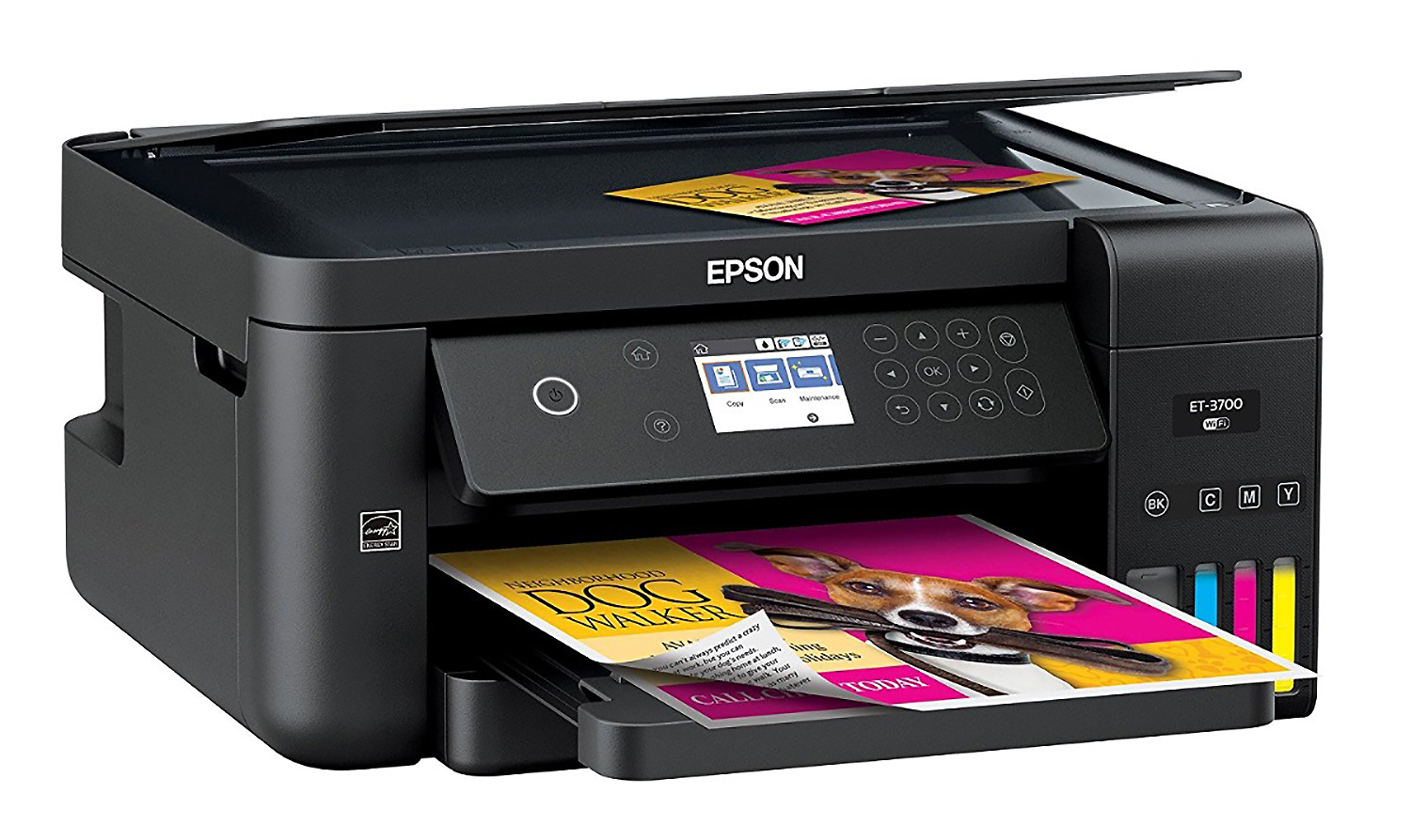
- The Craftsman who chooses pink, is hands-on and likes to try new things. This printer is used by the whole family and needs to adapt to a wide range of printing needs, from school projects to family photos. The versatile Epson Expression ET-3700 all-in one printer is perfect for the multi-tasking Craftsman. Pink is the colour of love, friendship and kindness. It motivates actions and fuels creative thoughts. wants intensity in experiences and wholeness in life.
Lüscher’s take? Sport, Eroticism, Productivity, Desire and Sexuality.

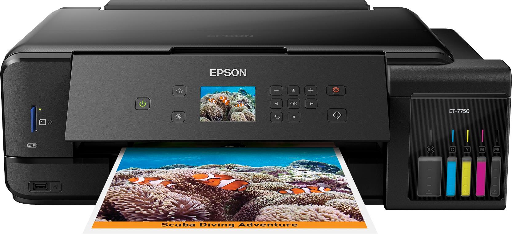
- Ultra violet, a secondary colour, the Artist’s pick, is a colour of wisdom, creativity and bravery. It denotes a sense of value, symbolizing power and ambition. The artist who works in a creative industry, such as graphic design or photography. They use Mac and Adobe programs exclusively for their creative business and rely on cloud services for document storage. The Artist understands colour management and is a stickler for having accurate colours when printing their work, making the Expression Premium ET-7750 their ideal printer choice.
Lüscher’s take? Mystic Union, Fusion between subject and object, Bodily Sensations, Enchantment, Magical State, relaxing effect dropping blood pressure, a state of Sensitivity and intuitive understanding and belief anything is possible.
Lüscher’s view on folks who picked secondary colours over primary signalled a troubled and unbalanced state. Not today. “Canadians love their beige and love their grey partly to our less disposable income, our economic reality,” said Lockhart adding colour today is more of a commodity much like other things and is commoditized to sell. For example, today before a product is re-designed, the colour is picked first.
Lüscher (September 9, 1923 – February 2, 2017) defined grey, brown and black as achromatic auxiliary colors that indicated a negative attitude toward life. Black held a unique value, especially if it was chosen over bright colours – denial, absolute giving up or abandonment. Yikes! Today his head would spin if he saw how prevalent black is in our culture!
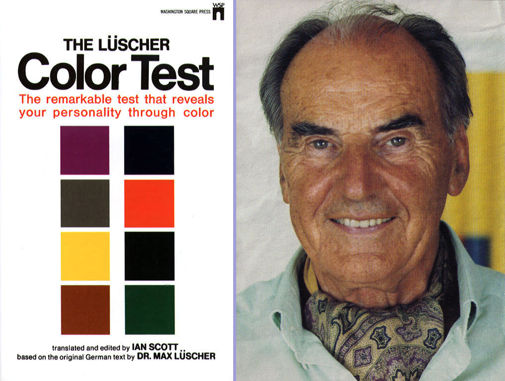
It can not be denied that colors affect our psyche. The original Lüscher’s test was comprised of dozens of colours but his simpler softback edition https://www.amazon.com/Luscher-Color-Test-Max/dp/0671731459 complete with eight coloured cards based on primary and secondary colours became an armchair analyst’s conversation piece. Picking the primary colours red, blue, yellow, green over the brown, violet, grey, black were signs of a stable happy person. Reversing the order raised flags of present, past issues and character weakness.
Earlier on in her life, Lockhart, who studied with the paint company Benjamin Moore researching with renowned HueGroup co-founder Leslie Harrington, used the Lüscher colour theory research among other references. It’s still unique to her. “Lüscher offered a lot more context compared to what the Internet does,” she said.
USING THE RIGHT COLOUR ON YOUR PRINTER
Here are a few tips from Lockhart on how to choose colour on documents
- Yellow is the brightest of all the colours and the first to be seen on a page. The downside is that it has low contrast and will not work with other bright colours, especially type. It can be irritating but some people associate it with happiness and brightness. In retail yellow if often associated to low cost, savings, budget, caution, “look over here”.
- Magenta is popular with the prevalence of pink today. It can go either way, considered a warm high value colour, something people would respond as being rich or expensive. It’s a good print colour because it can be darkened. In some ways it’s the opposite of yellow.
- Today blue in our society is associated to authority, conservatism. The lighter it gets is associated with creative thoughts, the sky is the limit. It’s the number one colour chosen worldwide. Darker navy blue is associated with expertise, authority.
- Best colour background? Today if you want to convey youthful energy you would use a pastel background to type on. You wouldn’t go wrong with black font.